Friday, 23 May 2014
Quarter Four Museum/Gallery Visit
Botticelli Exhibition at MGM Macau VS. SAS Photography Exhibition

- One similarity between the two exhibitions were that they both contained prints. Since the SAS exhibition was of photography, obviously it had prints of the photographs. And although I expected the Botticelli exhibition to display genuine works from the painter, most of the paintings being displayed there were actually only prints. However, unlike the SAS exhibition, they were prints of paintings and not photos. It was a bit disappointing.
 |
| Disappointing that I was only able to see a print of this piece |
 |
| SAS Prints |
- A major difference between the two exhibitions was that one showed works of a professional and incredibly famous artist while the other showed works of multiple student photographers. While the SAS students were taking these photos for a class and will probably never pursue a career in the subject, Sandro Botticelli worked as an artist and was commissioned by several people to create his paintings. Also Botticelli would have had years of training while the SAS students would have only taken a few classes.
 |
| Would have commissioned portraits of his patrons |
 |
| Photography of an SAS student |
- The exhibitions were also housed in very different locations. The Botticelli exhibition was placed in a hotel in a special space specifically designed for and dedicated to art exhibitions. It's very clean with it's walls that are only used to hang works of art. The SAS photography exhibition's location is very different. It was placed in a school's multi-purpose atrium with it's art being placed on cork board panels. The school exhibition is also outdoors and thus very open which invites more people to come look at it while the Botticelli exhibition was indoors and kind of hidden from public view.
 |
| A Botticelli piece hung on the wall of the MGM Art Space |
 |
| SAS Photography was hung on Cork Board |
- The medium of the artworks was also a big difference between the two exhibitions. The SAS exhibition used photography while the MGM exhibition showed paintings that used oil paint. They're very different because oil paint is a very traditional art medium, that would've been available in Boticelli's time (15th/16th centuries), while photography is a very modern digital medium that has only been available since the 19th century.
 |
| One of the only original works which was housed in a special small room |
 |
| The exhibition was placed outside |
Thursday, 12 December 2013
Large Format Printing

This photo was one I had taken about three years ago with a Holga camera. I took a photo of a mosque at Arab Street and double exposed it with a wall pattern of flowers. For the printing of this photo I set the contrast at 4.5 and exposed it with the red filter for 30 seconds.

This photo was taken by a 35mm film camera of two of my dogs outside. For the printing of this photo I also set the contrast at 4.5 and exposed it with the red filter for 45 seconds. Also, to make everything except the dog on the left darker, I used dodging.
Shutter Speed Project
For this project we had to photograph motion either frozen or blurred. To do this we would change the shutter speed on our cameras.


These two photos that showed motion blurred. The first is of one of my dogs barking and the second is of my other dog moving. I believe I used a shutter speed of around 1/30. Although the photos are already blurred, I with I had put a slower shutter speed so that the photos would be more blurred.


These two photos are my frozen motion photos. I took them of SAS students running on the track during their PE classes. For these photos I used a very fast shutter speed of 1/100. In the first photo the students are running and in the second photo the students are walking. In the second photo I got a few strange marks that appeared. Above the students, there is a bunch of flecks and on the right of the photo there seem to be shapes of people.
Sunday, 8 December 2013
Quarter Two Gallery Visit
1. This was probably my favorite piece of his that he showed. I love how it wasn't just an aesthetically pleasing piece of art but a social commentary about how technology is affecting the way we live. And he also talked about how he added a personal touch to it by having the guy watch TV indoors because his father had social anxiety.

2. I really like how although he acknowledged the fact that getting a successful art career can be tough , he didn't discourage pursuing it. And hearing his experiences from before he got successful when he worked at a restaurant and still remaining positive and how he never stopped pursuing his dream was really inspirational.

3. I think it's really cool how he branches into many different areas of art like he illustrates magazine covers, writes & illustrates children's books, draws his own comics. It's really nice to see how he has a job where he can do whatever he likes. It's nice to see how although art is seen as a really difficult career path to take, there are actually a lot of jobs that require it.

4. It was also really inspirational how he never stopped drawing even after being rejected multiple times for years. It shows that if you don't give up you will eventually achieve what you want. I want to double major in graphic design and go into a job that would incorporate it in the future and it's really nice to see that it is possible to make a career out of it.
Wednesday, 30 October 2013
Texture Film Project

This photo is of a wooden paper cutter with a grid in the art room, so it had a wooden and grid texture on it. Because of this grid, which is evenly spaced out, the composition is harmoniously organized. Since the negative of this photo came out really dark I had to increase the contrast when I printed it.

This photo is of a recycling bag within a cardboard box, so it showed a strange thick fabric texture. I would say that this is purely chaotic because there isn't really any order in it, the bag is randomly folded and the background is mostly just shadows. This was my favourite print I did for this project because of the bag's details which can be seen clearly.

This is a photo of a carpet, so it mostly showed a texture made up of geometric shapes. Because it seems to contain patterns, such as the parallel lines on the top left and the geometric shapes on the sides and bottom, but also has a bird in the middle I would say that it's harmoniously disorganized. Although I liked this photo, I felt like it came out a bit blurry in the end in some parts.
Sunday, 20 October 2013
35mm Camera Texture Project Inspiration

(Photo from Kool Cats Photography on Flickr)
I really like wooden textures so I used this photo as inspiration. I believe this one is harmoniously disorganized because the wooden planks are placed next to each other and they have a latch holding them together, but the wood and paint seems to be crumbling apart. So I plan to take a photo of something with a wooden texture for one of my photos.

(Photo from KaliPhoto.net)
I like this purely chaotic texture because of the random shapes and the whimsicality and strangeness of it. Even without colour, the fluid texture would still look really cool. So for this I would like to take a photo of mixed paint or something similar to get a texture like the one in the photo.
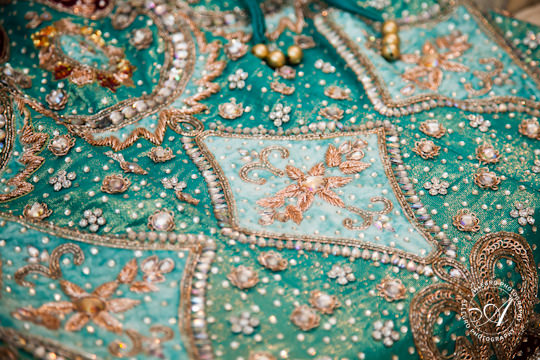
(Photo from allegrophotography.com)
This photo is of an Indian fabric which I believe is harmoniously disorganized because it doesn't seem to have a single distinct pattern, but instead has multiple things going on which all go together. To get a similar texture I would like to take photos of different kinds of fabrics or maybe take photos of some Indian clothing which I have.
Subscribe to:
Posts (Atom)