Thursday, 12 December 2013

Large Format Printing


This photo was one I had taken about three years ago with a Holga camera. I took a photo of a mosque at Arab Street and double exposed it with a wall pattern of flowers. For the printing of this photo I set the contrast at 4.5 and exposed it with the red filter for 30 seconds.


This photo was taken by a 35mm film camera of two of my dogs outside. For the printing of this photo I also set the contrast at 4.5 and exposed it with the red filter for 45 seconds. Also, to make everything except the dog on the left darker, I used dodging. 

Shutter Speed Project


For this project we had to photograph motion either frozen or blurred. To do this we would change the shutter speed on our cameras.


These two photos that showed motion blurred. The first is of one of my dogs barking and the second is of my other dog moving. I believe I used a shutter speed of around 1/30. Although the photos are already blurred, I with I had put a slower shutter speed so that the photos would be more blurred.


These two photos are my frozen motion photos. I took them of SAS students running on the track during their PE classes. For these photos I used a very fast shutter speed of 1/100. In the first photo the students are running and in the second photo the students are walking. In the second photo I got a few strange marks that appeared. Above the students, there is a bunch of flecks and on the right of the photo there seem to be shapes of people.

Sunday, 8 December 2013

Quarter Two Gallery Visit


1. This was probably my favorite piece of his that he showed. I love how it wasn't just an aesthetically pleasing piece of art but a social commentary about how technology is affecting the way we live. And he also talked about how he added a personal touch to it by having the guy watch TV indoors because his father had social anxiety.


2. I really like how although he acknowledged the fact that getting a successful art career can be tough , he didn't discourage pursuing it. And hearing his experiences from before he got successful when he worked at a restaurant and still remaining positive and how he never stopped pursuing his dream was really inspirational.


3. I think it's really cool how he branches into many different areas of art like he illustrates magazine covers, writes & illustrates children's books, draws his own comics. It's really nice to see how he has a job where he can do whatever he likes. It's nice to see how although art is seen as a really difficult career path to take, there are actually a lot of jobs that require it. 


4. It was also really inspirational how he never stopped drawing even after being rejected multiple times for years. It shows that if you don't give up you will eventually achieve what you want. I want to double major in graphic design and go into a job that would incorporate it in the future and it's really nice to see that it is possible to make a career out of it.

Wednesday, 30 October 2013

Texture Film Project


This photo is of a wooden paper cutter with a grid in the art room, so it had a wooden and grid texture on it. Because of this grid, which is evenly spaced out, the composition is harmoniously organized. Since the negative of this photo came out really dark I had to increase the contrast when I printed it.


This photo is of a recycling bag within a cardboard box, so it showed a strange thick fabric texture. I would say that this is purely chaotic because there isn't really any order in it, the bag is randomly folded and the background is mostly just shadows. This was my favourite print I did for this project because of the bag's details which can be seen clearly.


This is a photo of a carpet, so it mostly showed a texture made up of geometric shapes. Because it seems to contain patterns, such as the parallel lines on the top left and the geometric shapes on the sides and bottom,  but also has a bird in the middle I would say that it's harmoniously disorganized. Although I liked this photo, I felt like it came out a bit blurry in the end  in some parts.

Sunday, 20 October 2013

35mm Camera Texture Project Inspiration


(Photo from Kool Cats Photography on Flickr)

I really like wooden textures so I used this photo as inspiration. I believe this one is harmoniously disorganized because the wooden planks are placed next to each other  and they have a latch holding them together, but the wood and paint seems to be crumbling apart. So I plan to take a photo of something with a wooden texture for one of my photos.

(Photo from KaliPhoto.net)

I like this purely chaotic texture because of the random shapes and the whimsicality and strangeness of it. Even without colour, the fluid texture would still look really cool. So for this I would like to take a photo of mixed paint or something similar to get a texture like the one in the photo.

(Photo from allegrophotography.com)

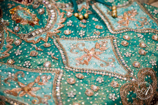
This photo is of an Indian fabric which I believe is harmoniously disorganized because it doesn't seem to have a single distinct pattern, but instead has multiple things going on which all go together. To get a similar texture I would like to take photos of different kinds of fabrics or maybe take photos of some Indian clothing which I have.


Photo Journal Entry #2


Thursday, 17 October 2013

Museum/Gallery Visit


  National Museum of Singapore 
(They had run out of the English pamphlets) 


I hadn't been to this museum in quite a while, so it was nice to go back and see it.


 1. This was really cool. I've always been really interested in vintage packaging designs - I even have a few old coke bottles that I found at a thrift store. But these were from the 1950s and they were brands I had never even heard of like Green Spot and Framroz. And the coffee cups were so tiny and cute and those had brands that I recognized like Milo and Ovaltine.

2. This bicycle is so cute, it's in my favorite shade of green. It reminds me of the carts they use to sell ice cream nowadays but this one is from the 1960s and they used it to sell little cake pastries at hawker centers. It's pretty crazy to see how some vendors really haven't abondoned this particular form of selling goods. I think it really adds to the culture of Singapore.

3. They also had this area where you could smell different spices. I love when museums add interactive sections in their exhibit because it makes it more interesting. And in this case you could smell them and get instructions telling you how to use them. Pretty cool. 


4. These tools looked like they were used in ancient times when they were only being used like fourty to fifty years ago. It's so incredible to see how some items have been used for so long and remained unchanged. Kinda like the bicycle cart (mentioned in #2) used to sell stuff here in Singapore. 

Thursday, 10 October 2013

Holga Project


This project was a bit stressful for me because it was my first time actually developing film, and the first two times I tried to do it, my film didn't come out for some reason. So, it took me three tries to finally develop it and even then most of my film came out too dark to use. It was also a challenge to put the film in the reel because we weren't able to look at it.


This photo is of my friend lying down near a window. The negative of this photo came out pretty dark, so I had to increase the contrast quite a bit. Originally, her face came out too dark so I had to use the dodging technique to make it lighter.


This photo was of the tie dyed shirts drying on Good Vibes Day. The negative for this also came out quite dark, so I had to increase the contrast and make it very high. Unfortunately, the photo came out a bit unfocused, but I liked it because it gave it a bit of an eerie feel.


This was a photo of a sleeping cat that I took. The photo for this unfortunately came out a bit blurry.


Monday, 16 September 2013

Photogram Photography

For this project we would take some photo paper and place either physical objects or transparencies on top of them and their outlines and some details would show up. 


For this photogram I placed some plastic dollar bills on top of the photo paper. Since they are plastic, thin, and had some transparent bits, you could see the many details on both sides of the bills. This was probably my favourite because they ended up looking really cool, especially since, for whatever reason, some bits would come out blurry sometimes.


For this self-portrait, I printed out a photo of myself onto a transparency and placed it on top of the photo paper. I tried really hard to get the full spectrum of light to dark shades, but for some reason, I couldn't get many white areas.


This was an Imitation of a Photogram by Melanie K. First I created the image on Photoshop using different brushes and then I printed it out onto a transparency and used it to create the image. Like my self-portrait, I couldn't get this photogram to show any white areas. I think I should've made the image darker on photoshop so that less light could've passed through.

Tuesday, 27 August 2013

Pinhole Camera


These are some photos I took with my pinhole camera. We created it in darkroom photography class with black cardboard paper and a piece of tin foil with a small hole. Depending on the brightness of the particular environment, we would keep the shutter open for a certain mount of time to make sure the photo paper was exposed the right amount.


This photo is of an SAS schoolbus. To take this photo, we went outside and placed the camera on the floor and waited.


This photo is of a tree decorated with baubles at the ecogarden. For this one, I just placed the camera on the floor looking up.


This photo is of the water at the ecogarden as well.

After taking the photos, which were negatives, we placed them on top of photo paper the same size and shot light over them to make them into positives.

Thursday, 15 August 2013

The Short Happy Life of Francis Macomber Reflection


Through the dialogue, you could tell that the Macombers didn't have a loving relationship, despite being a married couple. Margot would often be passive aggressive and say things in a pleasant tone just to spite her husband. Also, it was mentioned that there had been numerous times in the past when she had cheated on her husband. Their conversations gave insight on their troubled relationship where it seemed that Margot didn't care about her husband and his emotions very much while he seemed to care slightly more than she did because he demonstrated anger towards her cheating. Reading about their relationship through the dialogue made me infuriated with Margot for treating him badly and Macomber for allowing her to do that over and over again. 

I felt that the changing character thought descriptions, where you would get an insight into the thoughts of Macomber, Margot, Wilson, and the animals, gave a lot more depth to the story. Through this technique, the reader is able to view the story and relationships from different perspectives and get a deeper understanding of each of the characters. To me, being able to go into such profound characterization in such a short amount of pages was truly impressive. The section where in pages 44 and 45 where Macomber discusses his marriage and why they would never split up helps us understand how and why the hunting expedition affected their marriage.

At first, Macomber feels frightened during the expeditions while Margot shows excitement and eagerness to watch and be part of it. But then, after Macomber kills the buffalo, the roles reverse and Margot ends up being scared while he is the one showing excitement and exhilaration. Their marriage stayed intact because Macomber was too much of a coward and thought he was bad with women and she had already gotten too old and lost too much of her beauty to be able to leave him and not have access to his wealth. So when he loses his fear, Macomber would have the potential to leave Margot and leave her without a source of money; therefore, altering the equilibrium of their marriage.

At the end of the story, I was left with a sadness because right as he was getting to the pinnacle of his life, Macomber's life was cut short by the very woman who repeatedly caused him so much grief.

Monday, 12 August 2013

Testimony by Rita Dove

Testimony by Rita Dove

1. Is she saying that embracing the little things in life will give you the most pleasure?
2. Is she actually talking about the literal Earth or is it a metaphor for something else?
3. Does not giving something a name or discovering something new leave out all the negative things associated with it?
4. What is the message that this poem is trying to send?
5. By saying "the world called, and I answered. Each glance ignited to a gaze. I caught my breath and called that life," does she mean that she embraced the world and everything within it?

Thursday, 9 May 2013

Resistors in Series and Parallels Lab


1. Evaluate the differences between theoretical and experimental values.
Theoretical values are the values calculated before that you could possibly get and the experimental values come from the data you gather from the experiment. With our experiment, there seemed to be a difference between the theoretical and experimental values for some of the circuits we made.

2. Make some general statements of what you learned about circuits in series, in parallel, series-parallel, and parallel-series networks.
Series circuits are very simple to make because you only have to create one path for the current. Parallel circuits are more complex because, with them, you create more than one path for the current to move through. When the circuits included both parallel and series, they would sometimes get confusing and hard to build. 


3.Discuss other sources of error such as the effect of adding a voltmeter and ammeter in a circuit and not including internal resistance in the battery in your calculations.
The voltmeter was very simple to use, so there were no drastic errors in the voltage calculations of the circuit. The ammeter, however, could have been a source of error because sometimes we had a bit of trouble finding out the exact places to put it. Also, if you connect the positive and negative wires into the wrong areas, you would get an incorrect reading and you would have to switch them. Also, not having the wires connected correctly would be a source of error. If you don't include the internal resistance in the battery, the theoretical and experimental values are more similar.

Thursday, 4 April 2013

Electric Field Hockey Post-Game Analysis


1. Which direction do electric field lines point for positive charges?
The field lines point away from the positive charge

2. Which direction do electric field lines point for negative charges?
The field lines point towards the negative charge

3. What do the direction and strength of the field lines indicate for the (positively
charged) “puck?”
For the positively charged puck, the direction and strength of the field lines indicate the acceleration

4. Did the (positively charged) puck always move in the same direction as the field lines
it was passing over?
The positively charged puck wouldn't always move in the same direction as the field lines

5. What happened (or would happen) if you changed the charge of the puck from
positive to negative?
If you were to change the charge of the puck from positive to negative you would change the direction of the field lines from facing away from the charge to facing towards the charge

6. What happened when you increased the mass of the puck?
The puck would move slower

7. How did the distance between the puck and the particles affect the motion of the
puck?
The closer the puck would get, the faster it would get.

8. List two or three cool things you got the puck to do. Why did each one happen?
When I put two negative charges directly next to each other, the puck would bounce in opposite directions before swinging to the next negative charge.

I managed to get the puck into the goal by making it have a positive charge and putting a negative charge on to the lower right of it and a positive charge to the top right of it. It was repelled by the positive charge so it went down to the negative charge, swung around, and hit the goal.

I put a negative charge directly to the right of the positively charged puck. Then I surrounded it with four positive charges. The puck ended up moving back and forth on the negative charge in a circular rotation.

9. The field lines on the program are evenly spaced, with darker shades of grey indicating
a stronger field. This is a very clear way of presenting this information. However, it is
not what we will normally use. Why do you think that is?
It might not be completely accurate


Saturday, 16 March 2013

Gallery Visit Quarter 3

London


1. I think you could sort of consider the entire city of London a really big museum because everywhere you look you are surrounded by culture, history, and art; all around the city there are the showing musicals, statures, buildings with antique architectural images, etc. I loved it so much because it was so incredibly beautiful.


2. I went to the National Gallery in London. As I was walking around I got really excited every time I saw a painting I had learned about in Art History class for it was very different seeing them in front of me than in a textbook. I was surprised by the sizes of some of the paintings though; Giovanni Arnolfini and his Bride by Jan van Eyck was a lot smaller than I expected and The Ambassadors by Holbein was a lot larger than I expected. There were also people sitting in front of certain artworks and sketching them which was really interesting, because I've never seen that done in Singapore or any museum/art gallery outside of Europe.


3. I also went to the Tate Modern and was pretty disappointed to see that the Lichtenstein (one of my favourite artists) exhibit was in March, so I was unable to go see it. Some of the pieces on display in this museum were pretty strange. I saw one that looked like a furniture display from Ikea, and another was just a canvas painted black. I really liked this one piece that was basically the words violence, violins, and science spelled out in neon lights on a black wall that would flash at different times - I think it was the colours used that really appealed to me.


4. Another art gallery I went to was the Victoria and Albert Museum. This museum was gigantic; it seemed like they had sections of art from every place on Earth. We went to this museum twice. The first time we just walked around and looked around. The second time, my dad's friend's wife, who studies there, showed us around. She took us to this one area where they had random structures and art pieces that still weren't organized into certain exhibits. On the left is a picture of my Dad and I in that section of the museum in front of an incredibly large column. However, I was really confused as to how they were able to bring such large structures inside. 

The variety of art that it contained was amazing. I really like the section with all the stained glass. It was also really cool how there were these stairs, called the Ceramic Staircase, we used that had the roof above it painted with Roman gods.

(The Ceramic Staircase: Picture taken from Flickr)
5. We also took a bus to Windsor Castle where the rooms had everything arranged the way it would've been if the royal family still lived there which I really liked because you could walk around and get a closer look at some of the lavish furniture and the paintings hung on the wall looked like they belonged there. The fact that certain rooms stuck to one colour palette really appealed to me because every room you stepped into was completely different then the last one. There was also a section which showed the doll house collection of one of the previous queens which I found incredibly creepy since I'm scared of dolls. Beside that was a room with different portraits of the Queen. I found most of the photographs really nice and flattering, but there was one that had her superimposed on different backgrounds which I thought looked like somebody who had very minimal photoshop made. There was also a painting by Lucien Freud which, for the most part, I didn't really like. The crown which was painted on her head, I thought, was really well done.
   

6. St. Paul's Cathedral and Westminster Abbey were two of the churches we visited. St. Paul's was in the Baroque style and you could go up into the dome and look down at the main floor. Westminster Abbey was in the Gothic style so I found it a lot prettier because I find all the ornamentation gorgeous. There was a part in the church where they had a mirror set up parallel to the roof so that you would look at the ceiling which was absolutely breathtaking. The details in the designs were so gorgeous, I just wanted to stay there forever. I also took part of the holy communion there so which was quite an experience.

St. Paul's Cathedral
Westminster Abbey