Wednesday, 30 October 2013

Texture Film Project


This photo is of a wooden paper cutter with a grid in the art room, so it had a wooden and grid texture on it. Because of this grid, which is evenly spaced out, the composition is harmoniously organized. Since the negative of this photo came out really dark I had to increase the contrast when I printed it.


This photo is of a recycling bag within a cardboard box, so it showed a strange thick fabric texture. I would say that this is purely chaotic because there isn't really any order in it, the bag is randomly folded and the background is mostly just shadows. This was my favourite print I did for this project because of the bag's details which can be seen clearly.


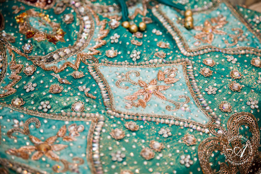
This is a photo of a carpet, so it mostly showed a texture made up of geometric shapes. Because it seems to contain patterns, such as the parallel lines on the top left and the geometric shapes on the sides and bottom,  but also has a bird in the middle I would say that it's harmoniously disorganized. Although I liked this photo, I felt like it came out a bit blurry in the end  in some parts.

Sunday, 20 October 2013

35mm Camera Texture Project Inspiration


(Photo from Kool Cats Photography on Flickr)

I really like wooden textures so I used this photo as inspiration. I believe this one is harmoniously disorganized because the wooden planks are placed next to each other  and they have a latch holding them together, but the wood and paint seems to be crumbling apart. So I plan to take a photo of something with a wooden texture for one of my photos.

(Photo from KaliPhoto.net)

I like this purely chaotic texture because of the random shapes and the whimsicality and strangeness of it. Even without colour, the fluid texture would still look really cool. So for this I would like to take a photo of mixed paint or something similar to get a texture like the one in the photo.

(Photo from allegrophotography.com)

This photo is of an Indian fabric which I believe is harmoniously disorganized because it doesn't seem to have a single distinct pattern, but instead has multiple things going on which all go together. To get a similar texture I would like to take photos of different kinds of fabrics or maybe take photos of some Indian clothing which I have.


Photo Journal Entry #2


Thursday, 17 October 2013

Museum/Gallery Visit


  National Museum of Singapore 
(They had run out of the English pamphlets) 


I hadn't been to this museum in quite a while, so it was nice to go back and see it.


 1. This was really cool. I've always been really interested in vintage packaging designs - I even have a few old coke bottles that I found at a thrift store. But these were from the 1950s and they were brands I had never even heard of like Green Spot and Framroz. And the coffee cups were so tiny and cute and those had brands that I recognized like Milo and Ovaltine.

2. This bicycle is so cute, it's in my favorite shade of green. It reminds me of the carts they use to sell ice cream nowadays but this one is from the 1960s and they used it to sell little cake pastries at hawker centers. It's pretty crazy to see how some vendors really haven't abondoned this particular form of selling goods. I think it really adds to the culture of Singapore.

3. They also had this area where you could smell different spices. I love when museums add interactive sections in their exhibit because it makes it more interesting. And in this case you could smell them and get instructions telling you how to use them. Pretty cool. 


4. These tools looked like they were used in ancient times when they were only being used like fourty to fifty years ago. It's so incredible to see how some items have been used for so long and remained unchanged. Kinda like the bicycle cart (mentioned in #2) used to sell stuff here in Singapore. 

Thursday, 10 October 2013

Holga Project


This project was a bit stressful for me because it was my first time actually developing film, and the first two times I tried to do it, my film didn't come out for some reason. So, it took me three tries to finally develop it and even then most of my film came out too dark to use. It was also a challenge to put the film in the reel because we weren't able to look at it.


This photo is of my friend lying down near a window. The negative of this photo came out pretty dark, so I had to increase the contrast quite a bit. Originally, her face came out too dark so I had to use the dodging technique to make it lighter.


This photo was of the tie dyed shirts drying on Good Vibes Day. The negative for this also came out quite dark, so I had to increase the contrast and make it very high. Unfortunately, the photo came out a bit unfocused, but I liked it because it gave it a bit of an eerie feel.


This was a photo of a sleeping cat that I took. The photo for this unfortunately came out a bit blurry.